Hi Thomas!
it not absolutely errors, I would call this "in development"
and in general - I three times tried "to leave" yEd)) because of these small imperfections, but having got acquainted with (already in hundreds) other mind-map & concept-map editors, I as a result come back)) Because yEd is the best , however here nevertheless there is a number of imperfections. And I trust that it is only temporary)
1. Connections. In Editor:
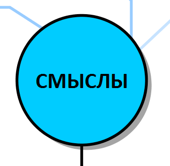
In Viewer:
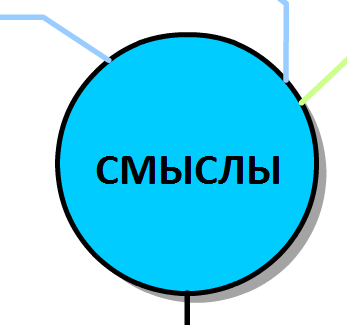
- as you can see, lines unexpectedly appear above shapes though it wasn't so conceived
2. Groups. Editor:
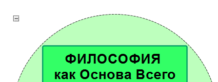
Viewer:
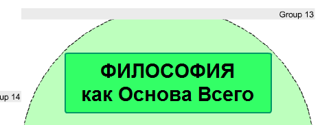
that is, group label in Viewer doesn't disappear and located over group contents
3. Lines over objects. Editor:
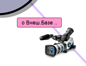
Viewer:
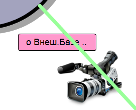
a. here already really we see Error - color changed.
(the reason probably that in the original of color was with transparency. )
b. the line moves to the forefront, bypassing Shape
c. the line moves to the forefront, bypassing PNG-image
4. Background !!! It is very important..
I need to change background-color, to me it isn't necessary all the time only white)) (well and not only me, certainly. ) After all cards (and other works) can be different flowers, and a white substrate all... spoils)
In an ideal (and it belongs to feature request fo yEd as a whole rather) - it would be good to allow to establish not one general Background for all editor, and for every work separately. (both color or img) - And!.. to export according to these settings..
(Thomas, please tell, whether I should create separate post here for this request? . or it is enough of that I here wrote it. though probably yes, after all you consider vote. or you so understand extreme importance of this completion? . ;)
5. One more important detail - for Export Settings - It is opportunity to establish initial zoom coefficient and coordinates. For example, I have important initial content - will allow Help either the general greeting, or the preface. And I would like that user started "reading" the map from it. Then I need to establish at once necessary Zoom and coordinates. And we now see at once all map, and important notes is lost (and it will be not necessarily read. )
6. For Viewer toolbar - along with the "fit content" button, it would be desirable to have also the "Real size" button ( Zoom 1:1 / 100% ) ...
7. Following "report" ;) concerns rather to the Editor. If to create big Shape and to place it on a background (Lower selection) - that all ok while we won't allocate this object. Then, at all without watching that it is on a background, it is impossible to allocate any object which is less than it and enters its area. Decides only through de-selecting. And if to do such background linings:
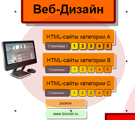
and then to rule contents, a lining it is necessary to cut out or remove every time, and then anew to position.
...
probably, there was something else, but now I unfortunately can't remember.. =)