A mere usability remark:
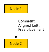
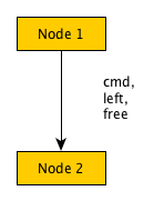
After editing an aligned text, it moves to another position, probably based on the center position of the text. However, with left alignment, it's more logical to anchor to the left, etc.

then, editing the label, its position is moved far away from the arrow while it feels more logical to keep the left side because it was aligned there -- and presumably fair to consider an anchor relative to the arrow

This position is not very beautiful at all.
I hope this helps -- I think yEd is a very nice tool to work with, so much nicer and more modern than xfig!