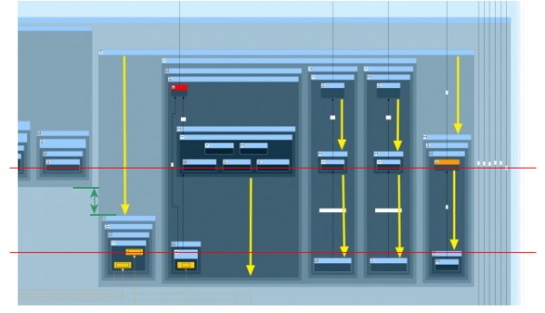
In that case, the space is a result of hierarchic layout's core strategy of assigning nodes to layers and the deep nesting levels of your graph.
E.g. have a look at this annotated image of your graph.

The red lines represent two consecutive layers for nodes in your diagram. Nodes in the same layer are placed on a horizontal line.
The green lines represent the layer distance due to the nesting depth of your nodes. (Actually, the layer distance might be even less if there are even more group nodes for that layer that are not in the image.)
If you have integrated labeling enabled, the vertical green distance is probably twice the minimal layer distance, because the algorithm has to fit your edge labels into the vertical green space as well.
In short, the placement is tight with respect to the algorithm's paradigm.