Hi yEd team, thank you very much for this awesome app.
I have just a small problem.
When using yEd graph editor, I often revert the colors in order to create a dark mode (to protect my eyes for long working hours).
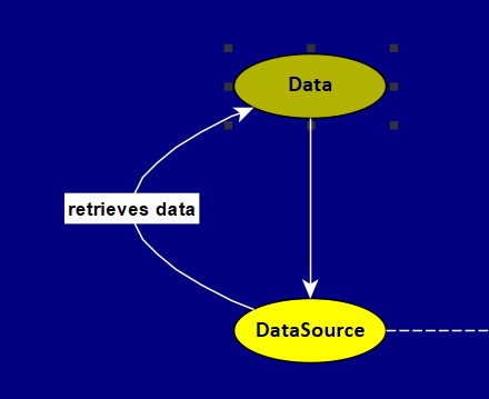
Here is an example of a 'dark mode' map:

The problem is that, when in 'dark mode', the selection box is dark too, which makes it hard to see (as can be seen in the example above, the node Data is currently selected) and as a result, it is hard to adjust the size of the shape. This is especially true for nodes containing long text. For these nodes, I often want to elongate the node to cover the whole text, but I cannot see the selection dots easily.
I've tried to change the color of this selection box in preferences, but I haven't found any way yet.
Could you please help me with this problem? Thank you.