To me, even as a business user, yEd is in many ways brilliant!
HOWEVER there are some rough aspects that are stopping it from gaining a wide uptake by other mainstream consumer/business users.
One problem it that is insufficiently obvious to new non-academic/business users what "Node" and "Edge" mean. Business users are not stupid (!) they just need a little help explaining the jargon, and then everybody wins.
[My understanding is that in normal diagram building speak "Node" really means "Shape" and "Edge" really means "arrow" or "line" or "connector", yes?]
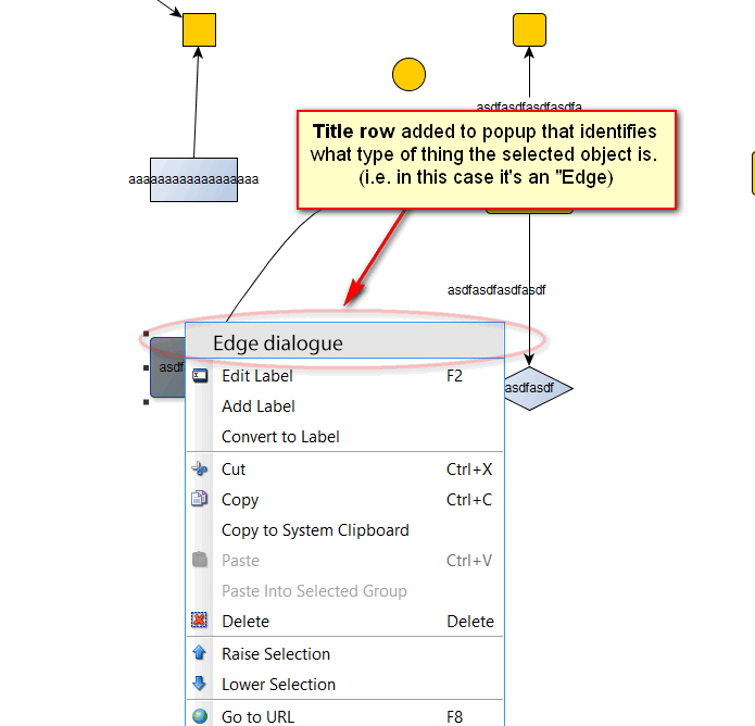
Either way rather than change your entire interace & documentation wording (!), a simple, low cost solution would be to explain the jargon by example. My suggestion would be that when you right-click on an object, that the popup window needs to have title row that tells the user what type of thing the object that they have selected actually is. (i.e. Edge or Node).
So it might simply say:
"Edge dialog"
(or "dialogue" if you are feeling anglophilic?!). This should appear when you right-clicking on a connector/arrow. Likewise it might say "Node dialog" if rick-clicking on a shape.
WARNING: I fully expect that this will not get much support from your existing userbase, because it is of no use to them personally. HOWEVER this will be extremely helpful to any new users who are not from Computer Science backgrounds and for this reason would dramatically help your conversion rates of new visitors to long-term users. And therefore be good for your business.
Moreover, it would not interfere with anything else and would be extremely trivial to implement.
You may not like this but to be honest, if I had my way this is the full text I would use:
Line ("edge") dialog
With fresh eyes... trying to help.
J
