I would like to ask a couple of questions.
Question 1#
When I use the Excel Import option it is possible to select or tell Yed to use some palette icons for what I am importing.
#2 Consultation / Recommendation
I am trying to make a network diagram from the information I have in excel, you could give me your recommendations of what would be the best option to achieve the desired.
Example:
1-Information on Excel
|
EQUIPO1 |
Gig 3/3 |
Gig 0/10 |
EQUIPO2 |
|
EQUIPO1 |
Gig 3/4 |
Gig 0/11 |
EQUIPO3 |
|
EQUIPO1 |
Gig 3/5 |
Gig 0/12 |
EQUIPO4 |
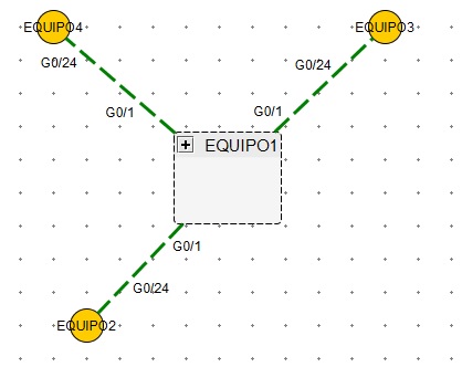
Desired diagram:
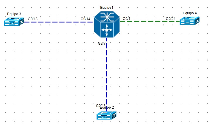
Obtained Diagram